Claude Design: Consistency First
The Premise
Six months ago I built a multi-brand Figma design system to cover Commerce, BigCommerce, Feedonomics and Makeswift. One source of truth across four brands, with shared foundations and brand-specific surfaces. That alone solved most of what we needed it to solve.
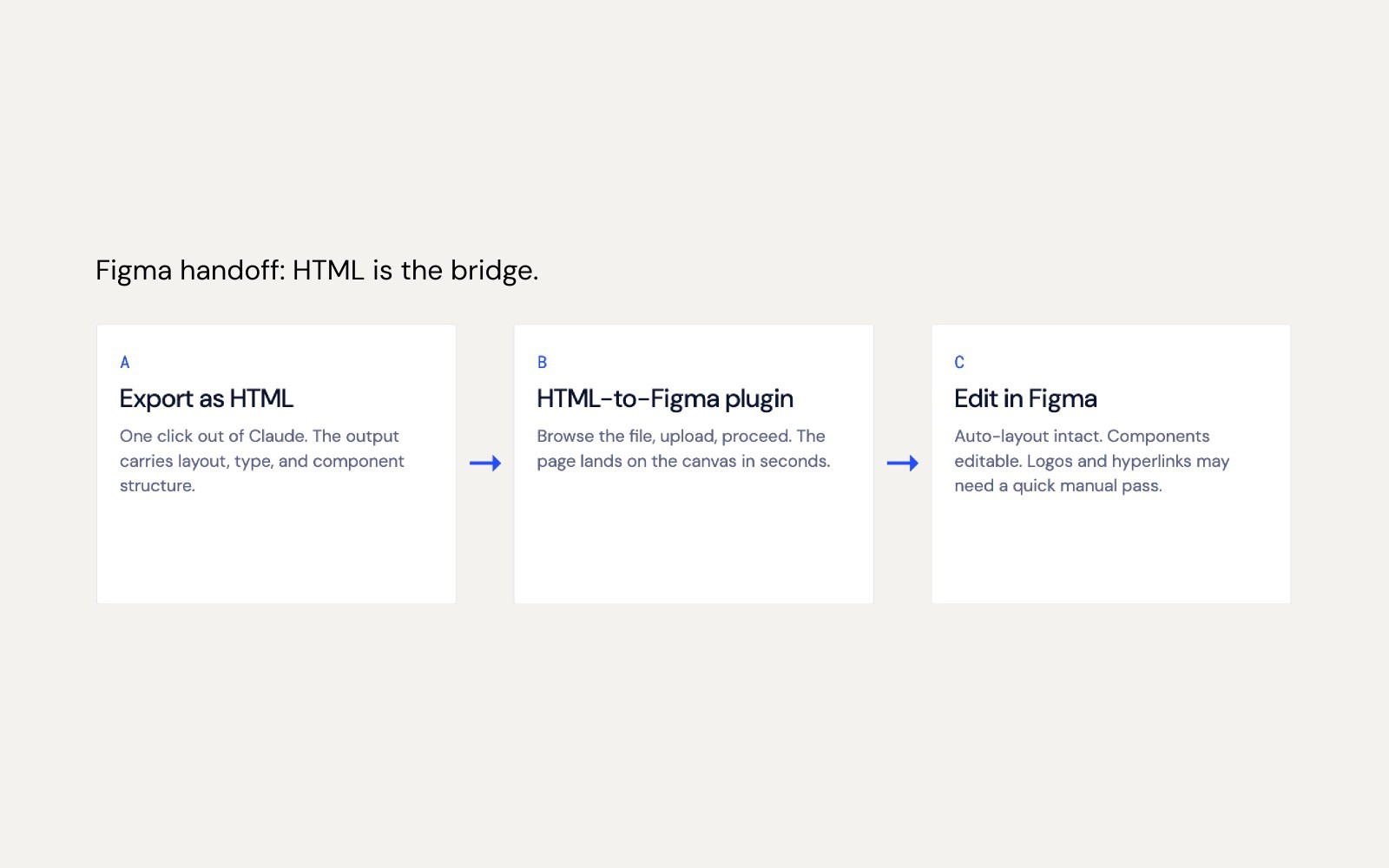
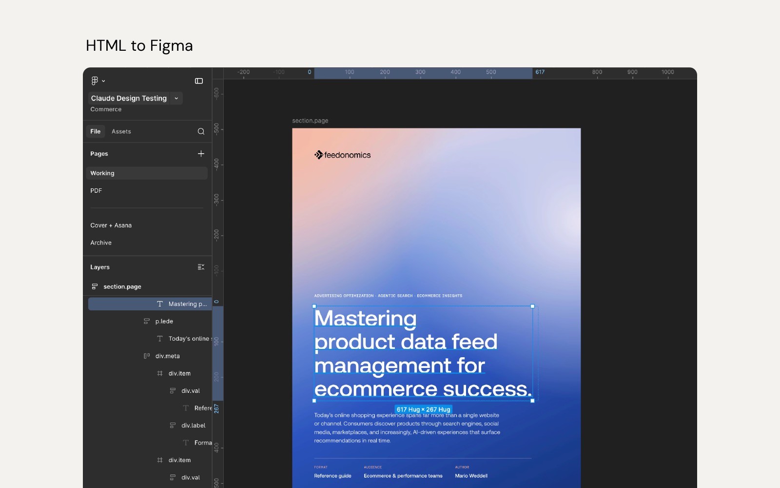
Three months ago I connected that system to Claude. The same tokens, components and rules, now accessible to our design and development team through the chat interface. It opened up a different kind of speed. We could prototype website interfaces in Claude using our actual tokens, see real brand output in seconds, and pressure-test the system in ways Figma alone couldn't surface.
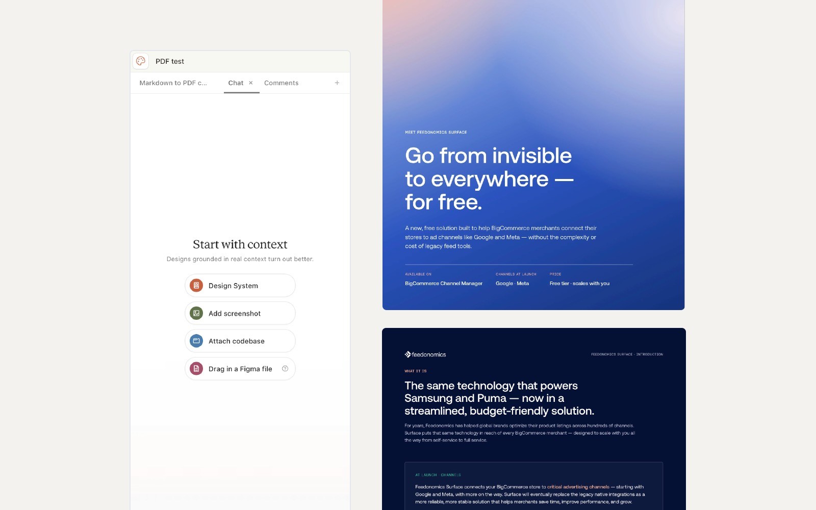
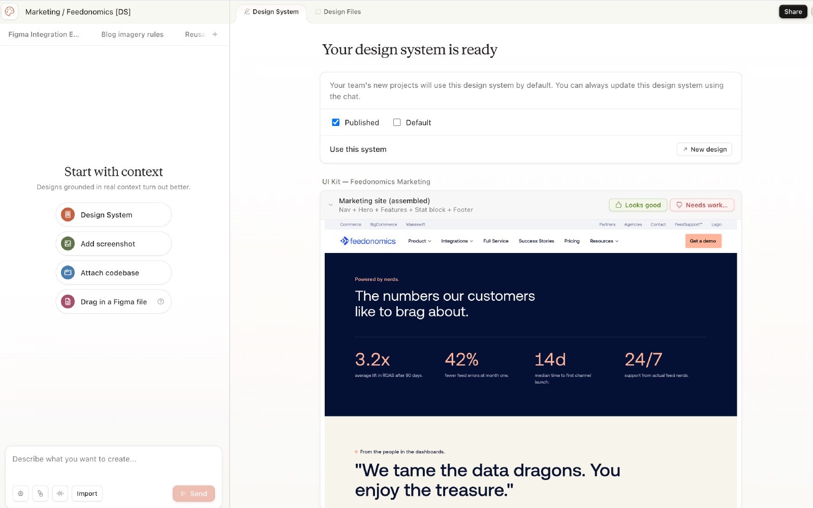
A few weeks ago I started exploring Claude Design, and it opened up a different question entirely. This wasn't an integration anymore, it was a different way to think about what a design system even is. Not a library you reference, but an environment that builds with you. And it opens the door to something we couldn't do before, giving marketing the ability to self-serve decks, one-pagers and thumbnails directly from the system.
This wasn't an integration anymore, it was a different way to think about what a design system even is. Not a library you reference, but an environment that builds with you.
The bottleneck I've been trying to solve is real. Four brands, one design team, and a steady drip of low-stakes asset requests that eat the time we need for higher-leverage work. Marketing wants independence. Design wants brand integrity. Both sides are right, and the gap between them is where this exploration lives.
The question I started with was simple. Could a design system live natively inside an AI environment without losing the consistency that makes it a system in the first place?
The answer turned out to be yes, mostly. But the more interesting answer is what the experiment taught me about design systems in general.
The Architecture Decision
The first real decision, going back to the original Figma system, was whether to build one system that covered all four brands or four separate systems with shared foundations. I tried the unified approach first because it felt like the cleaner answer. It wasn't.
When you mix brands into one system, everything starts to blend. Feedonomics surfaces end up with BigCommerce styling. Sister-brand logos show up where they shouldn't. The system treats every brand asset as fair game, which is exactly what a design system is supposed to prevent.
Splitting them solved it. Each brand gets its own scoped system with its own tokens, components and rules. The foundations are shared but the surfaces are separate. That decision held up in Figma, and it held up again when I connected the system to Claude. If anything, AI made the principle sharper. AI doesn't forgive ambiguity. If two things can be confused, they will be.
That decision held up in Figma, and it held up again when I connected the system to Claude.
That's a useful reminder. Most design systems carry more shared structure than they should, because human designers can hold the brand context in their heads. AI can't. Building for AI made me more disciplined about scope than building for humans ever did.
Tiering the Release
Once Claude Design was live and in Beta, the next question was who got to use it for what. Not every asset carries the same brand risk. A blog thumbnail going slightly off-brand is recoverable. A keynote deck going off-brand in front of a customer is not.
I worked through the tiering with our creative director. She brought the lens of how the broader creative team actually moves through asset requests day to day, and I brought the systems thinking. Where the lines should sit, what the system could hold without supervision, what needed a designer in the loop. Good governance is rarely one person's call, and this part of the work benefited from that back and forth.
We landed on tiering by stakes.
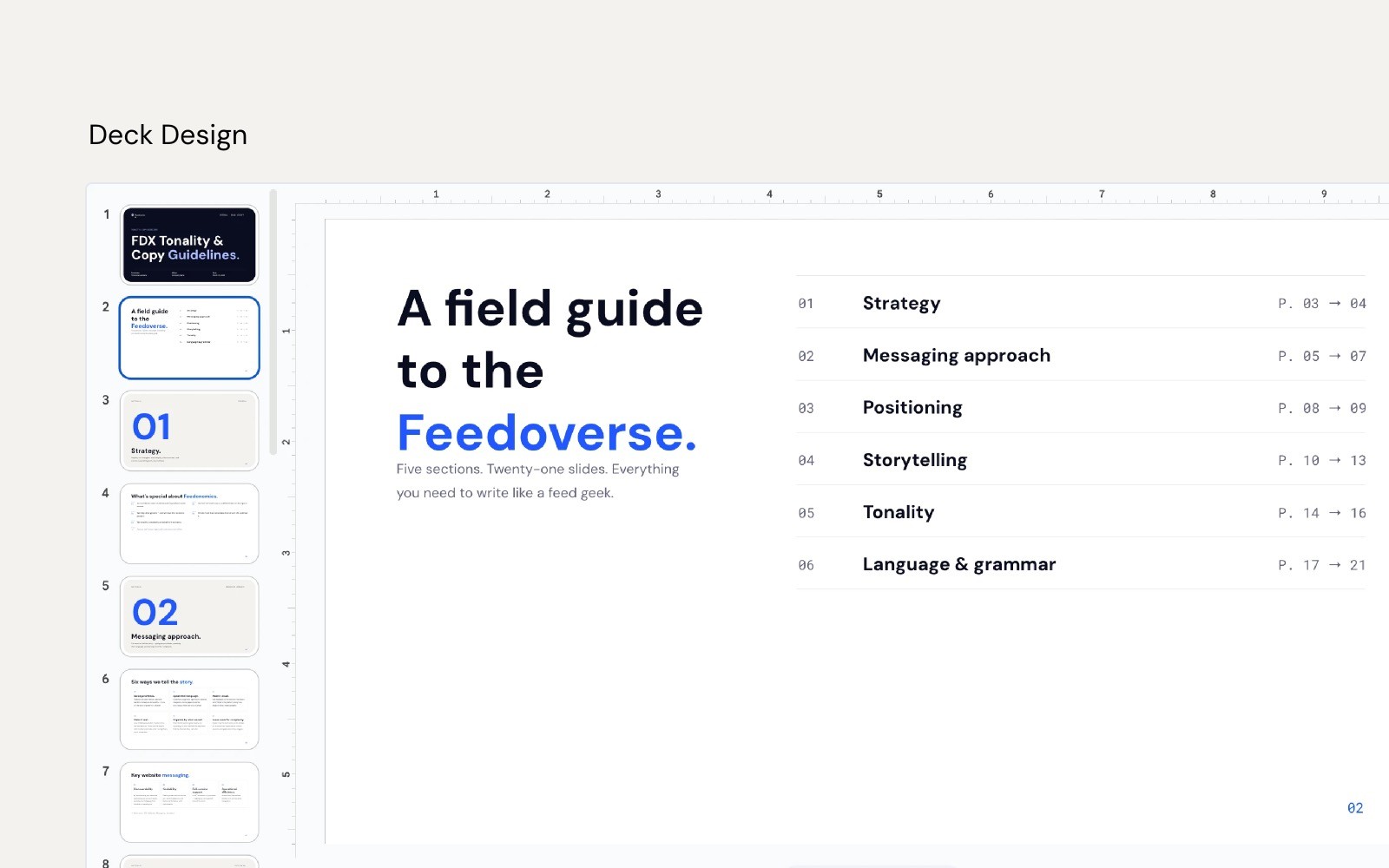
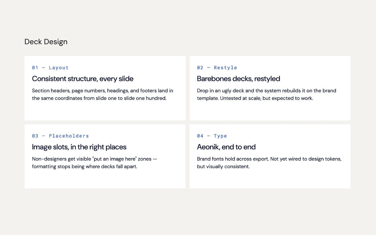
Slide decks are self-serve. Once the template is locked, PMs can run them on their own. Decks have a tight enough structure that the system can hold the brand without supervision.
One-pagers and PDFs go through design. The system handles the layout heavy lifting, but a designer finishes the imagery and reviews before anything ships. The structure is repeatable, the polish isn't.
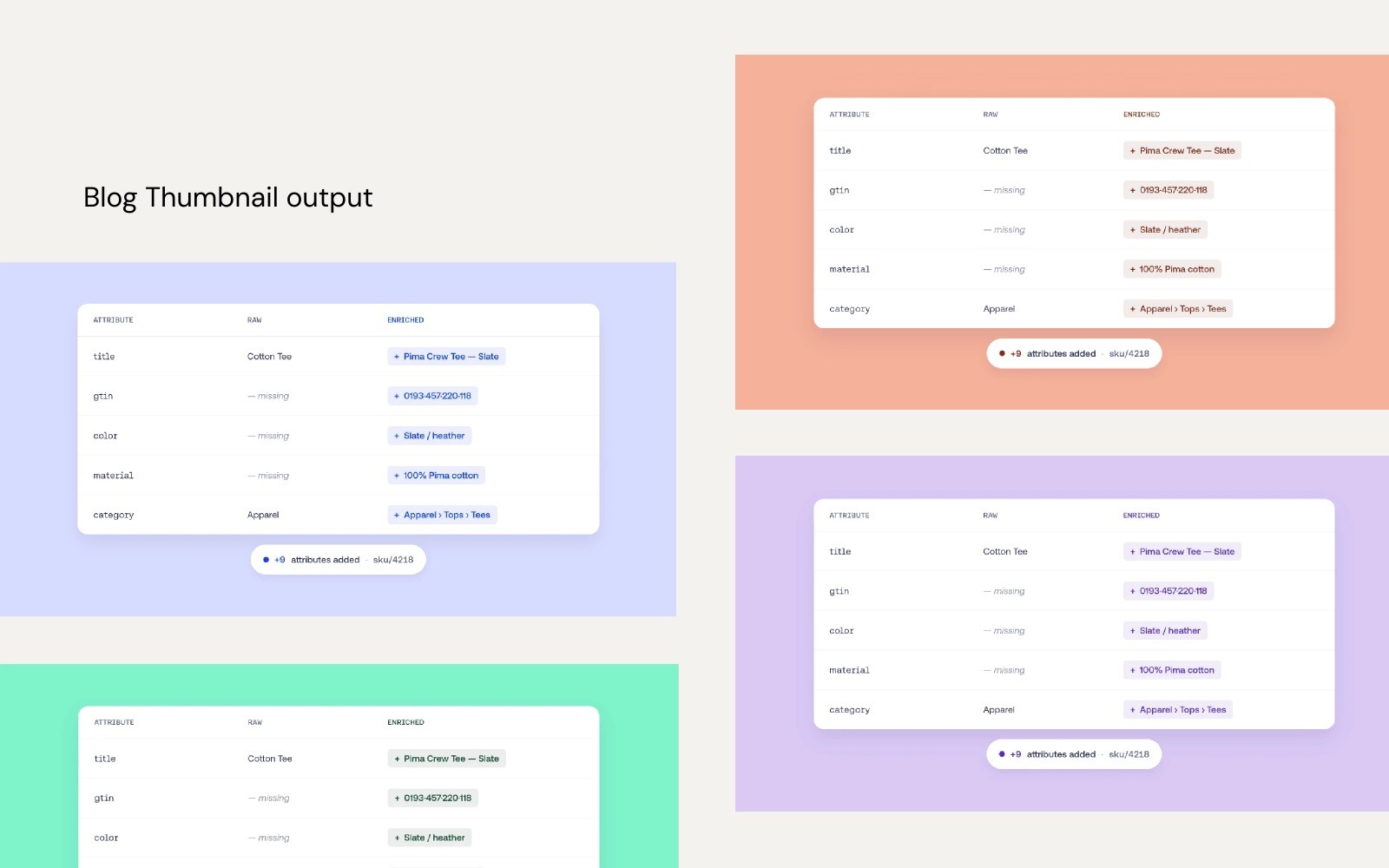
Blog thumbnails go through design too, but on a different model. Claude kickstarts the concepts, generating three directions in three color variations. A designer picks, refines and finishes. The system isn't replacing the designer here, it's removing the blank page.
Tiering by stakes is governance, but it's design governance. It's the same call you make when deciding what gets a token versus a component versus a one-off. The lesson generalized.
What I Learned
Most of what I learned came from things going wrong.
The PDF kept inventing copy. I'd give it a brief and it would helpfully fill in the gaps with its own marketing language. The fix was a verbatim copy rule. Use only the words provided, nothing else. That single rule changed how I thought about prompts. Prompts aren't instructions, they're constraints. The job isn't to describe what you want, it's to close every door you don't.
The PDF also kept truncating. A four-section brief would come back as three. The fix was a completeness rule plus an intake audit, where the system confirms what it received before generating anything. That mirrors how I'd brief a junior designer. Repeat the ask back, then start the work.
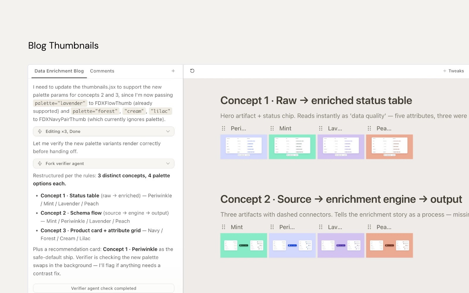
Blog thumbnails kept returning a single option. I had to explicitly require three concepts in three color variations. Nine outputs minimum. That sounds rigid, but it forced the kind of breadth a good first-pass concept exploration needs anyway. The constraint made the output better, not worse.
Each of these fixes was small. Together they made the system go from interesting to usable. That's the part of design systems work that never makes it into a portfolio. The patient, unsexy job of writing rules in response to failure. It's most of the actual craft.
That's the part of design systems work that never makes it into a portfolio. The patient, unsexy job of writing rules in response to failure. It's most of the actual craft.
Looking back across the Figma system, the Claude integration and Claude Design, the same principles kept showing up. Constraints make systems usable. Every fix I added narrowed what the system could do, and every one made it more useful. Open-ended systems feel powerful in theory and break in practice. Governance is a design problem, not an ops problem. Tiering by stakes is the same call you make when deciding what gets a token versus a component versus a one-off. And audience is the hardest part. The system has to serve designers, PMs, marketers and developers. That mixed audience is what makes any real design system hard to get right.
The medium changed. The work didn't.
The system is roughly seventy percent of the way there. Good enough to use for prototyping and exploration, not yet ready for full marketing self-serve. The gap is mostly governance, brand guidelines that aren't fully locked, and platform constraints around permissions and sharing. The next phase is finalizing the deck template, building out enablement materials so the team can actually run the system without me, and locking down governance for the long term. Three conversations, in that order.
What I'm taking from all of this is that the principles hold up in any medium. Scope tightly. Constrain deliberately. Tier by stakes. Write the rule when you find the failure. The Figma system taught me that. The Claude integration confirmed it. Claude Design is showing me how far it can go.
May 5th, 2026