Feedonomics Rebrand & Design System
Building the Foundation
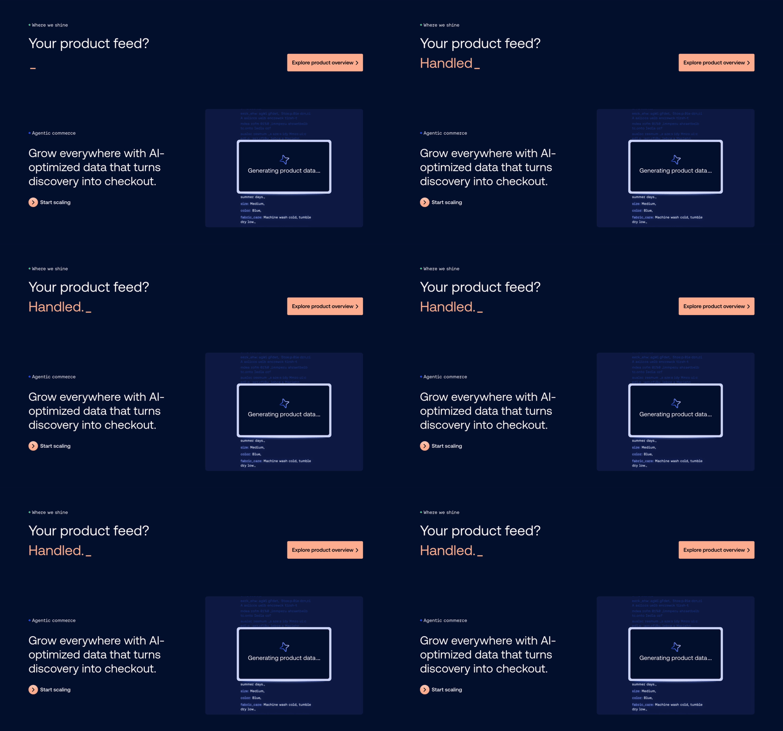
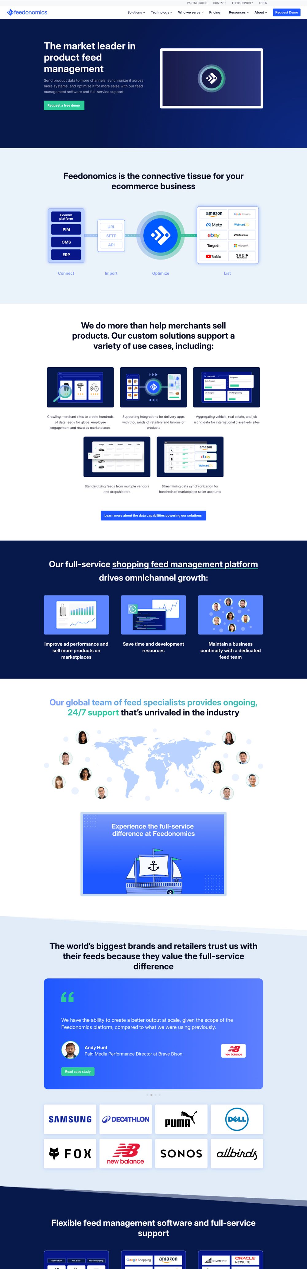
Feedonomics is a sub-brand under Commerce, alongside BigCommerce and Makeswift. This one started small: refresh the brand. Six months later, it had turned into a full rebrand where everything but the logo was back on the table, plus a move off the old site's standalone stack and into Makeswift as the page builder with Contentful as the CMS, the same combination already running BigCommerce and Makeswift, now stretched to hold a third brand.
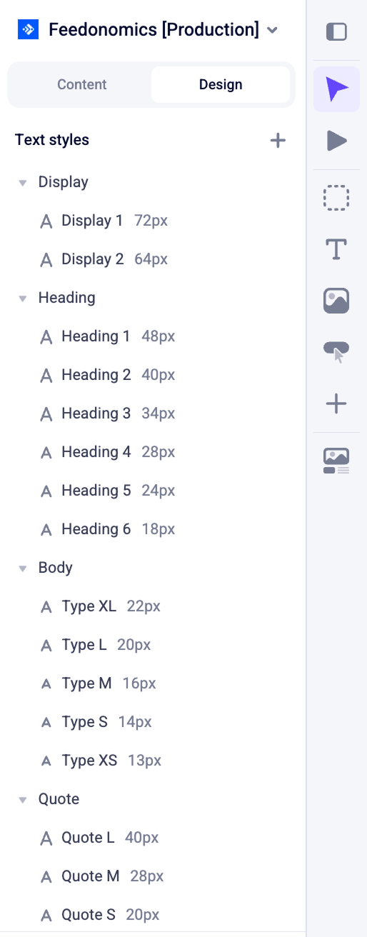
My seat at the table was design systems: turning "new brand" into typography scales, spacing rules, and components that would hold up across a hundred future pages nobody had designed yet.

Not a Solo Job
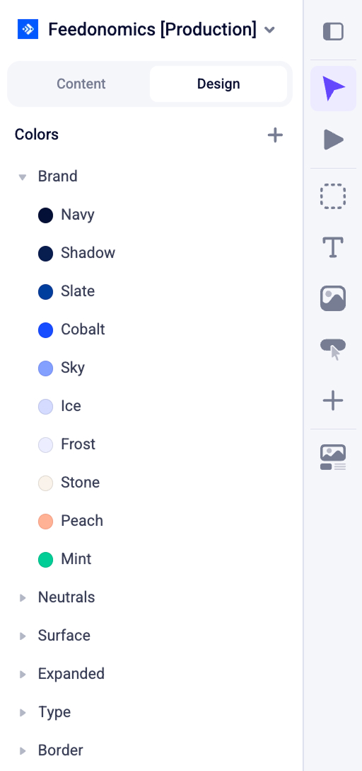
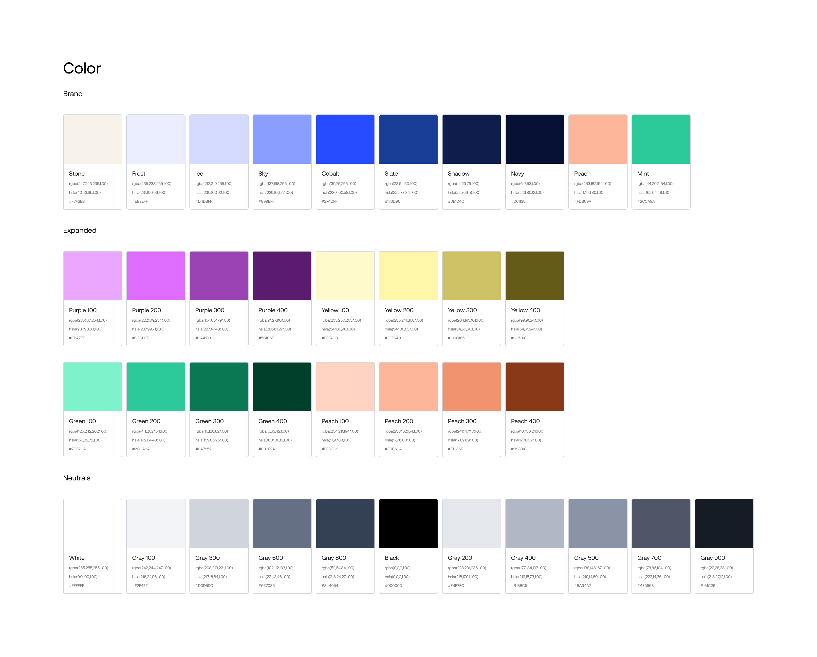
None of this was one person's work, and the parts I'm proudest of aren't mine. Color came from our brand designer Rob Rodriguez. Page design and graphics were led by our senior web designer Juan Roque. And by the back half of the project, most of my own time was spent shoulder to shoulder with our developers, turning specs into shipped, working components. A rebuild this size only crosses the line as a team, and this one had a good one.
I owned the core design system architecture, first building out the foundational components in Figma and then mapping matching tokens and sections into Makeswift. This unified structure defined the typography, spacing, and responsive layout rules required for cross-platform consistency. By creating this comprehensive "kitchen sink" reference, I optimized the page-building process for both designers and publishers while providing targeted training to ensure seamless adoption.
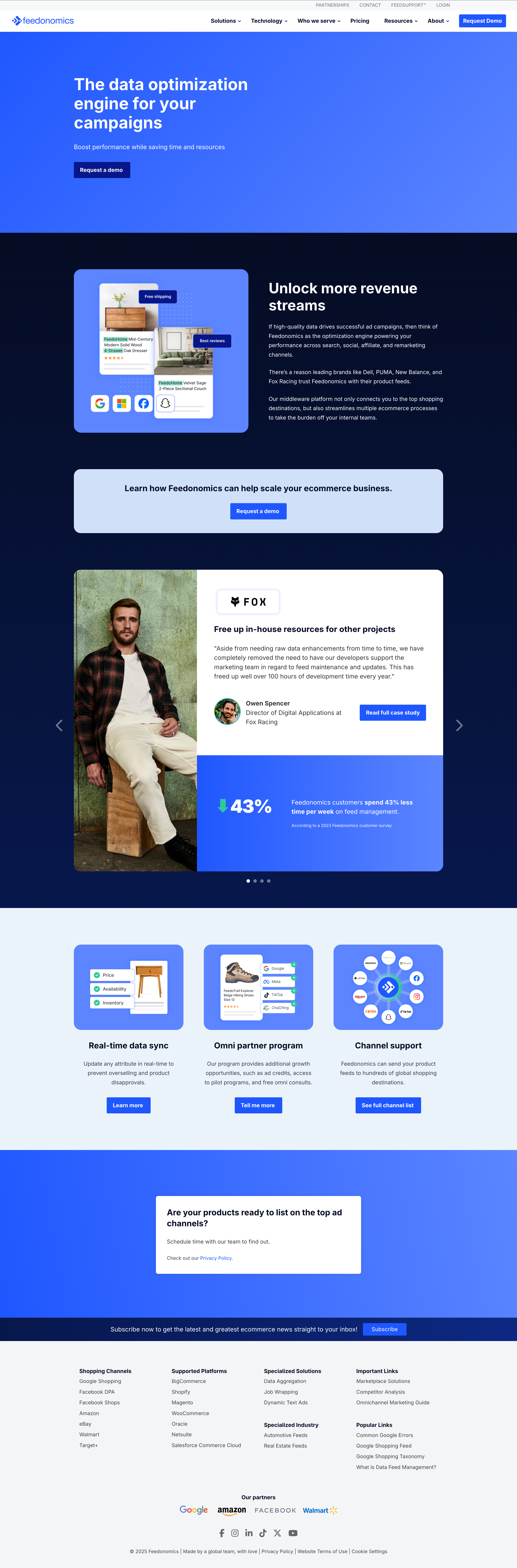
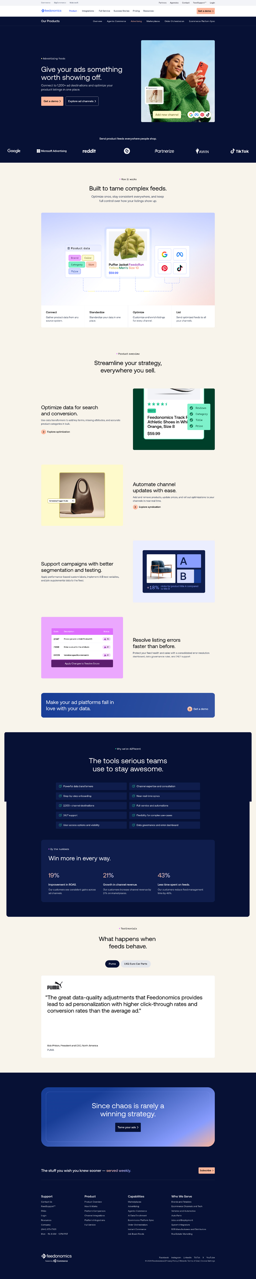
The Component System, in Full
I put together annotation specs for every component: structure and content rules, interactive states, and responsive behavior at each breakpoint, desktop down to mobile, working closely with the dev team throughout to make sure nothing fell through the cracks. I tracked all of it in a running document called the FDX Component Review: every component's status, open questions, and sign-offs from design, publishing, and SEO in one place instead of scattered across Slack threads.
That document is internal, but the list underneath it isn't a secret. Here's what actually got designed and shipped, grouped by what it does rather than what we happened to call it in the file.
Navigation & Structure
Content & Typography
Interactive & Motion
Media
Data, Cards & Forms
Layout Templates
A Resources System That Scales
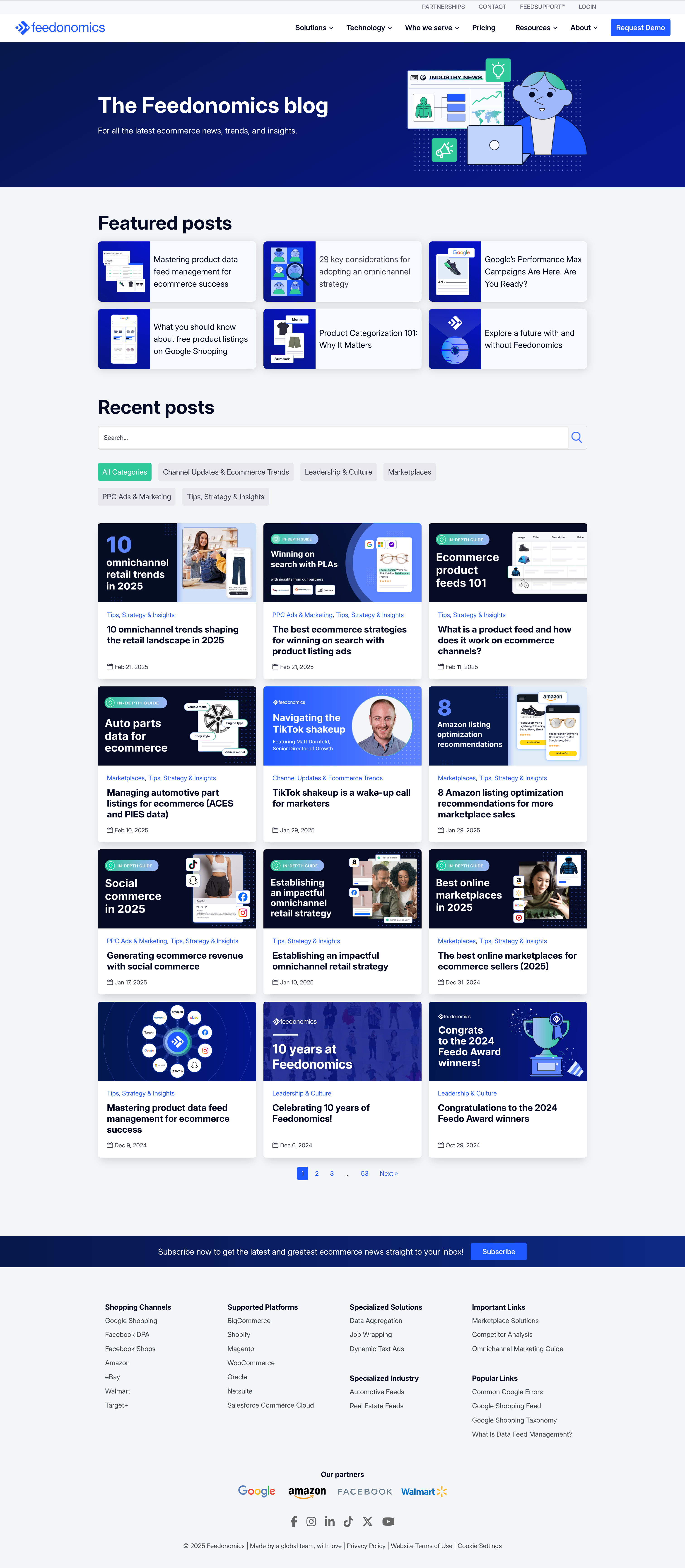
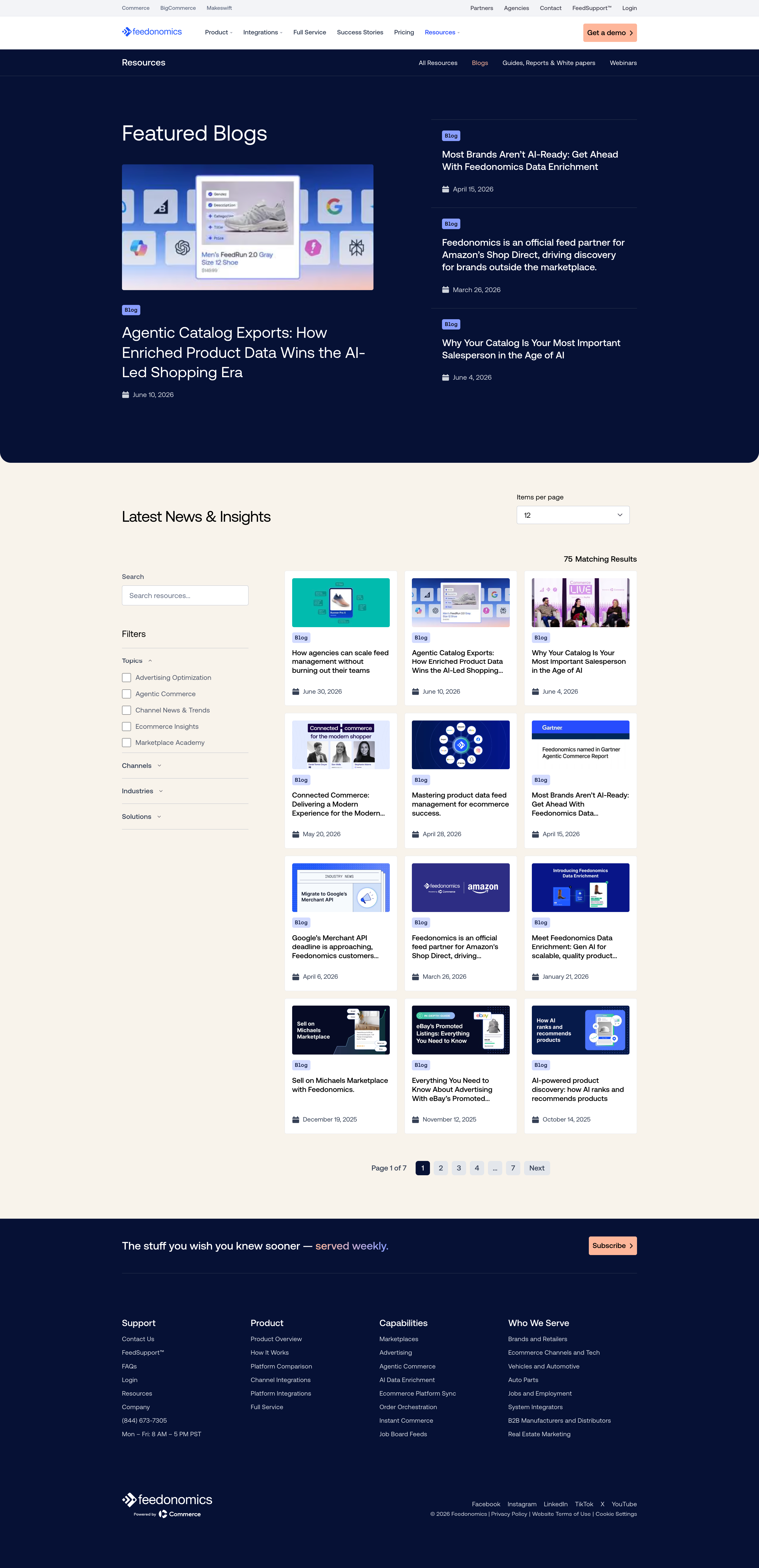
The largest single piece of this project was the resources section. Feedonomics runs a blog, success stories, webinars, and gated guides and whitepapers, and the old site treated each as its own one-off build. The goal was a layout system for the parent resources hub that could repeat cleanly across every content type, with child page templates that reused as much of that system as possible while still flexing for what makes a webinar page different from a blog post.
Same component logic, same spacing rules, same card patterns, applied consistently instead of rebuilt per content type. It's the same principle behind every design system I've worked on: reuse what you can, and only break the pattern where the content genuinely demands it.
Where It Landed
Six months, three names on the credits I actually want up there, and a system built to outlast the project it launched with. The best measure of a design system isn't the pretty parts, it's whether someone who wasn't in the room can build a page next quarter without breaking anything. That was the goal from day one, and it's what shipped.